Anthony Caton
October 4, 2018
Share
Caton Manifesto X Toyota Phase 1

To commemorate the launch of the new Toyota Avalon in the Middle East. Anthony Caton, Creative Director of Caton Manifesto was selected by Toyota to host media at the launch event in Dubai and to create 40 gender-neutral, limited edition gifts to mark the collaboration.
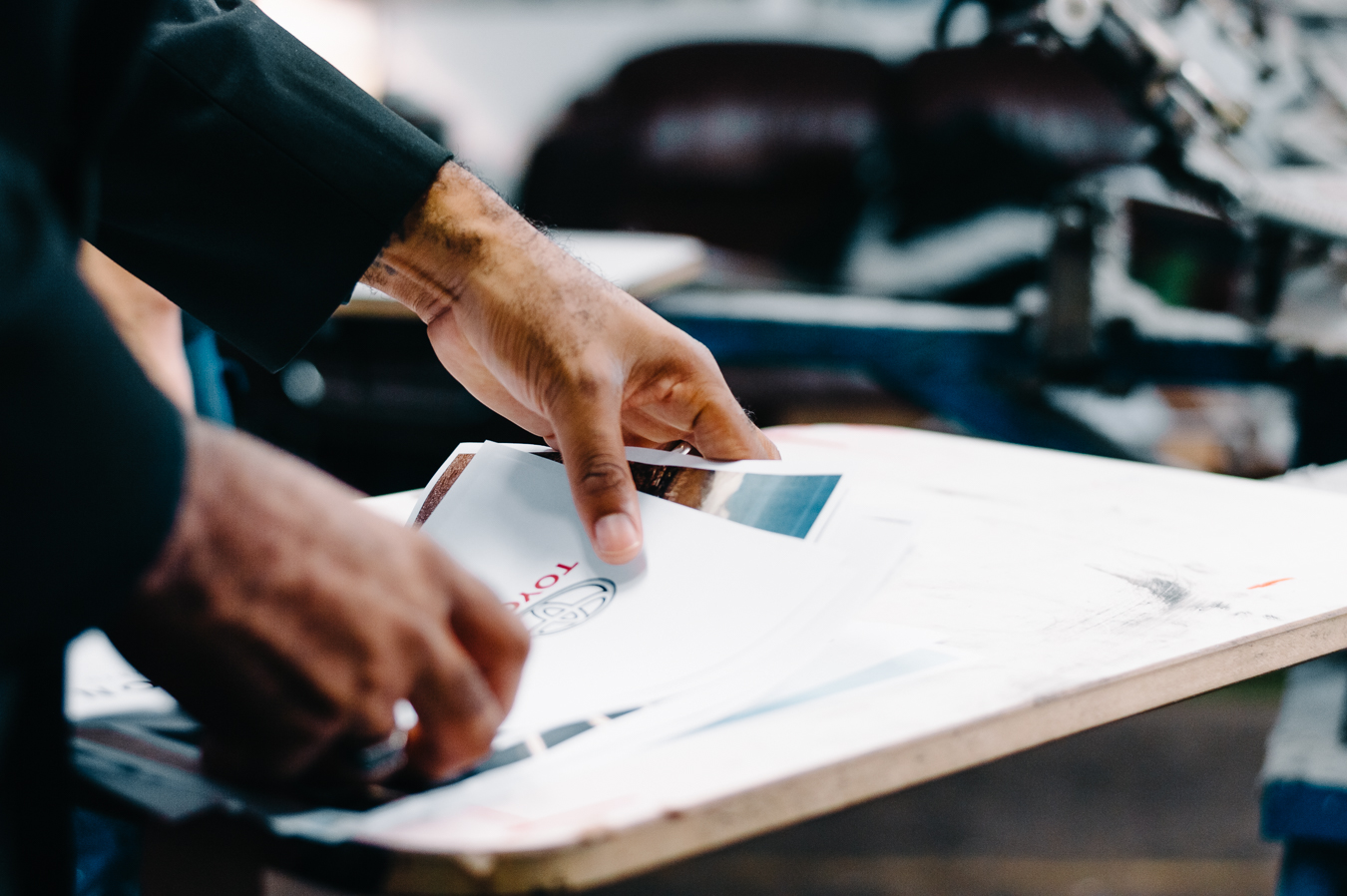
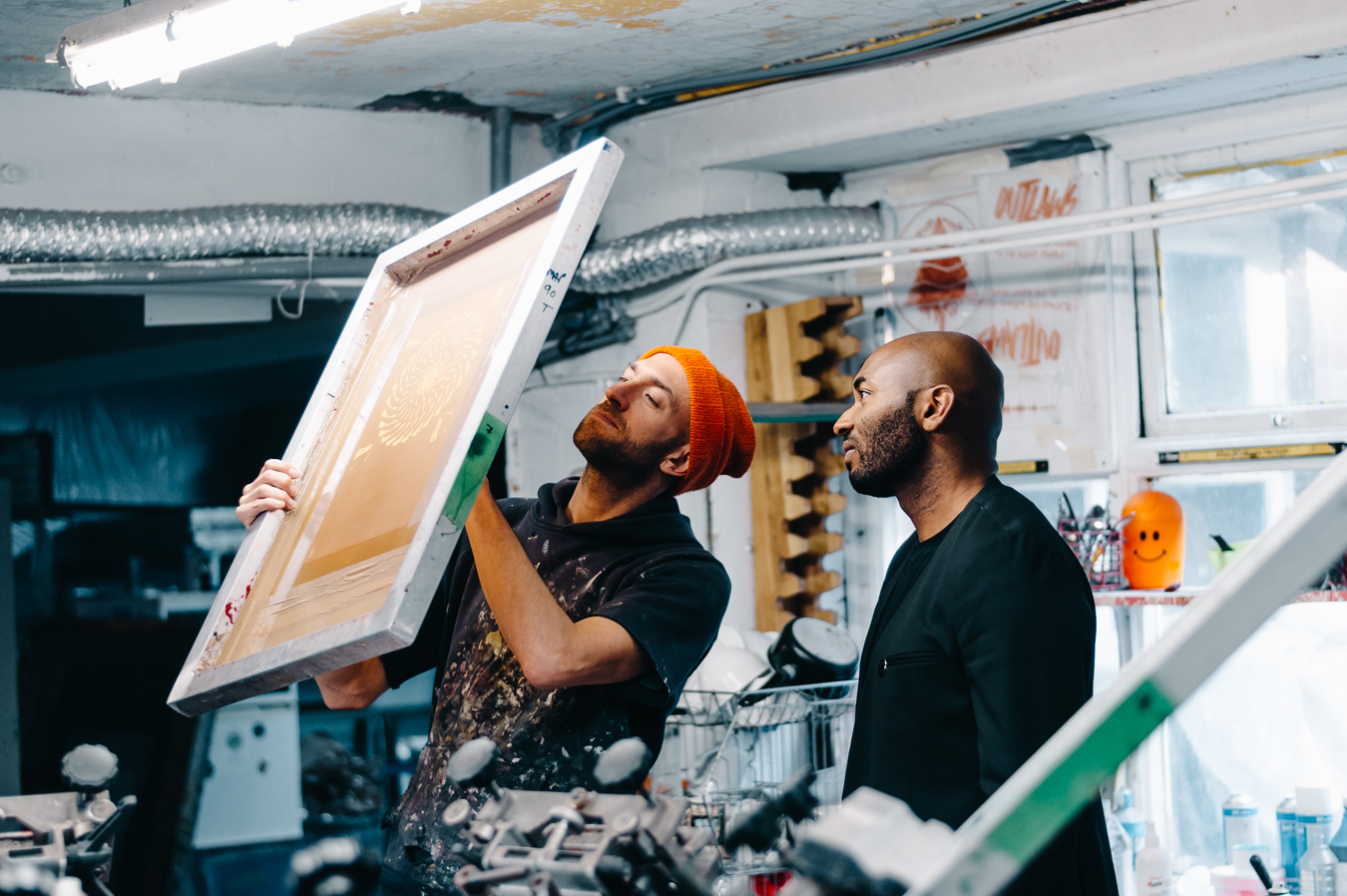
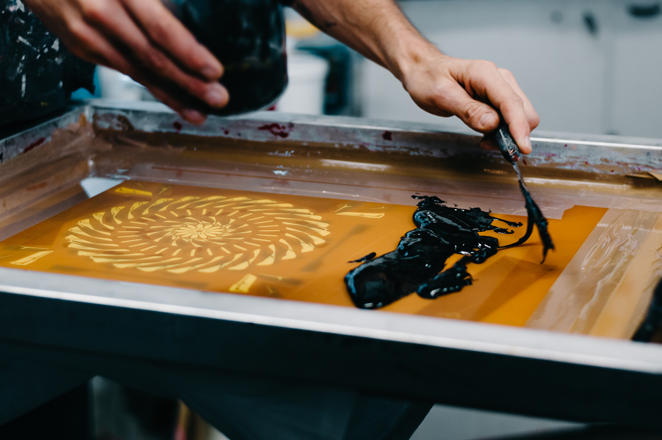
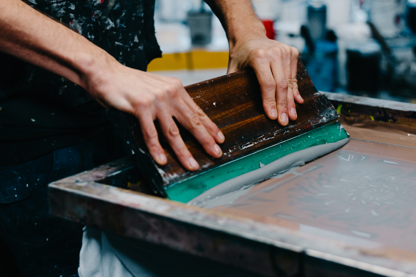
Drawing parallels to the craftsmanship and luxury represented in the vehicle, Anthony decided to create a run of limited edition silk squares. Each square was hand cut , rolled and screen-printed with environmentally friendly dyes, of the highest quality.
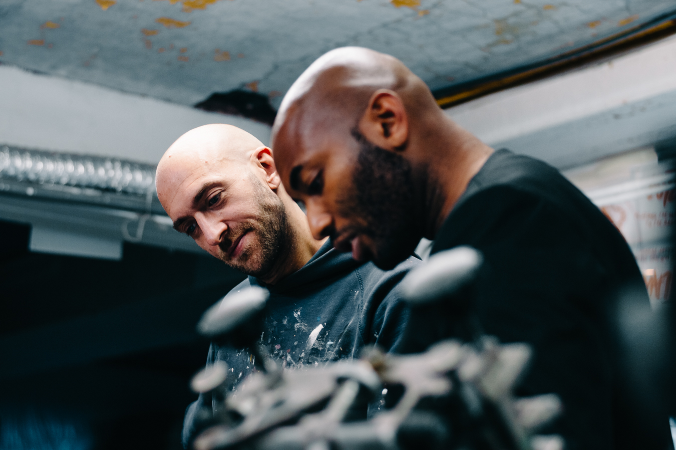
Here is a fly on the wall view of the printing process and the 3 different designs.
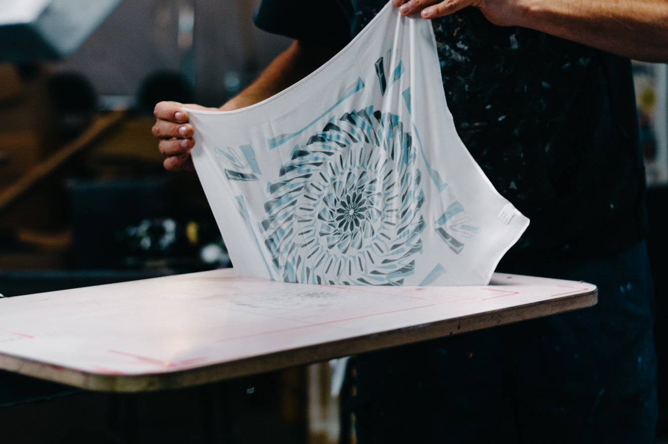
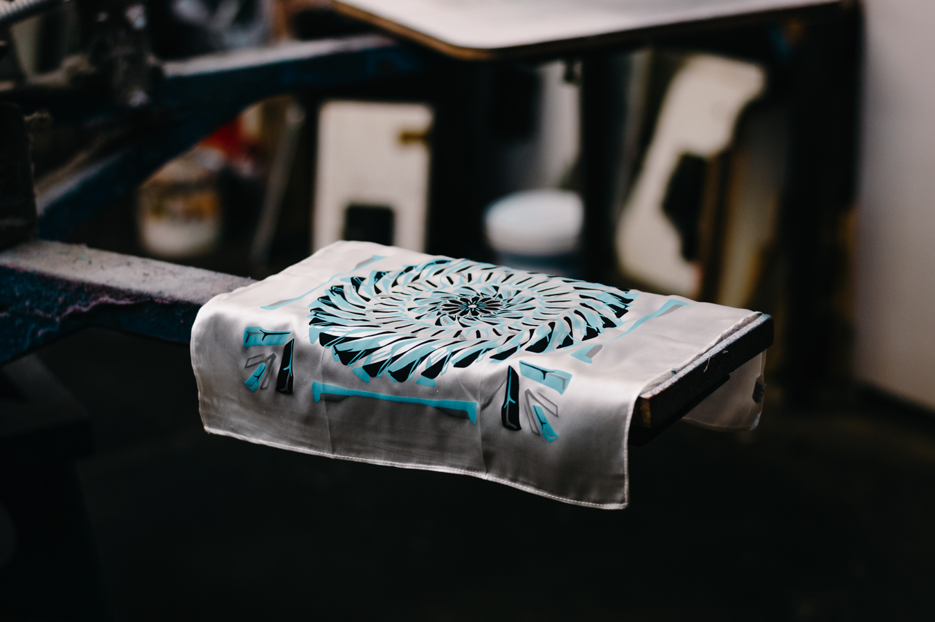
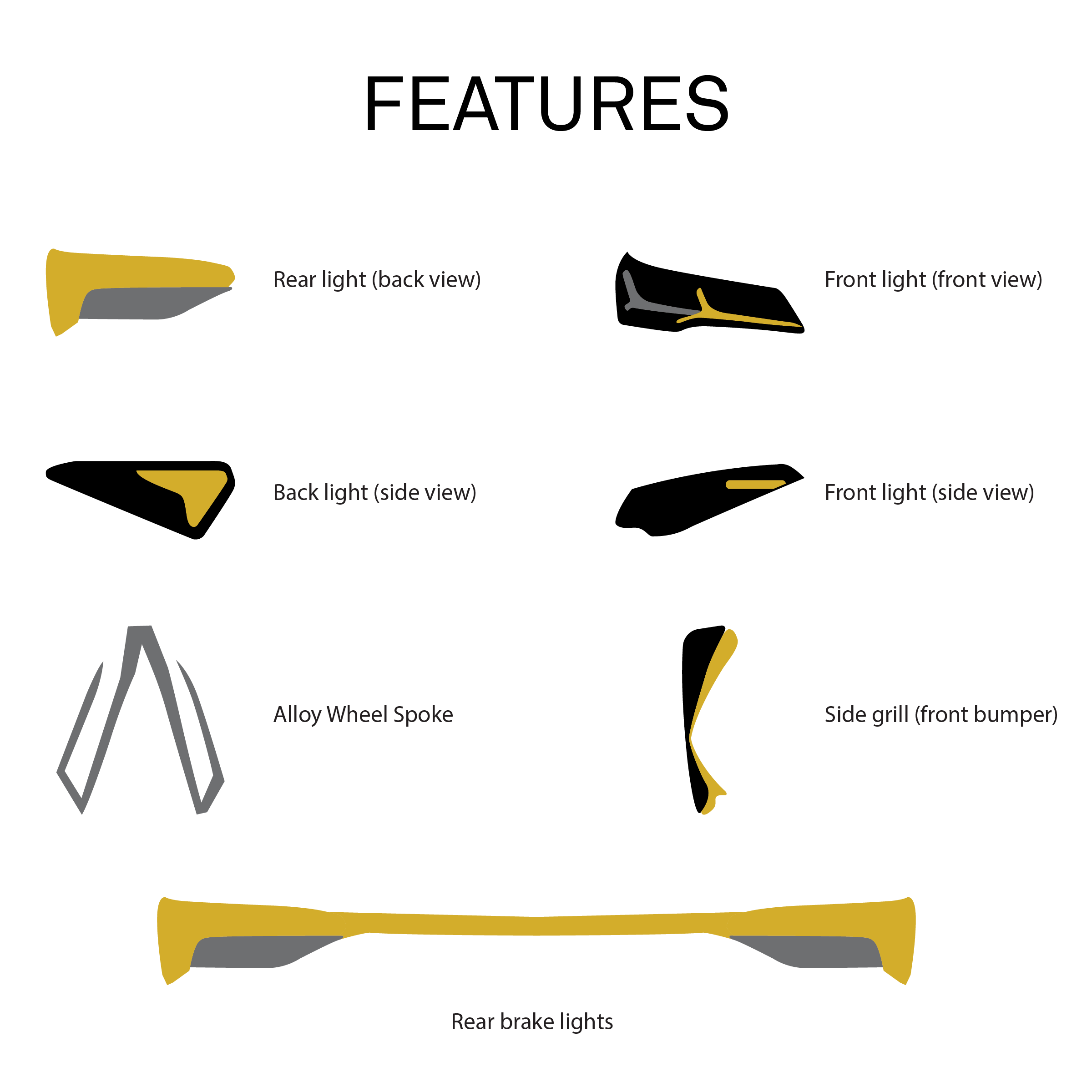
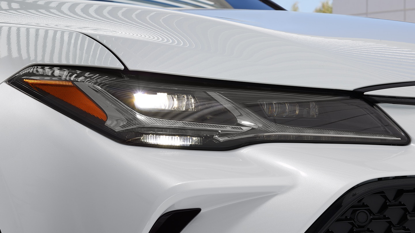
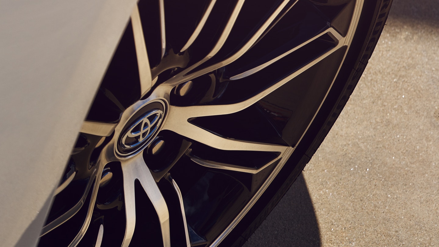
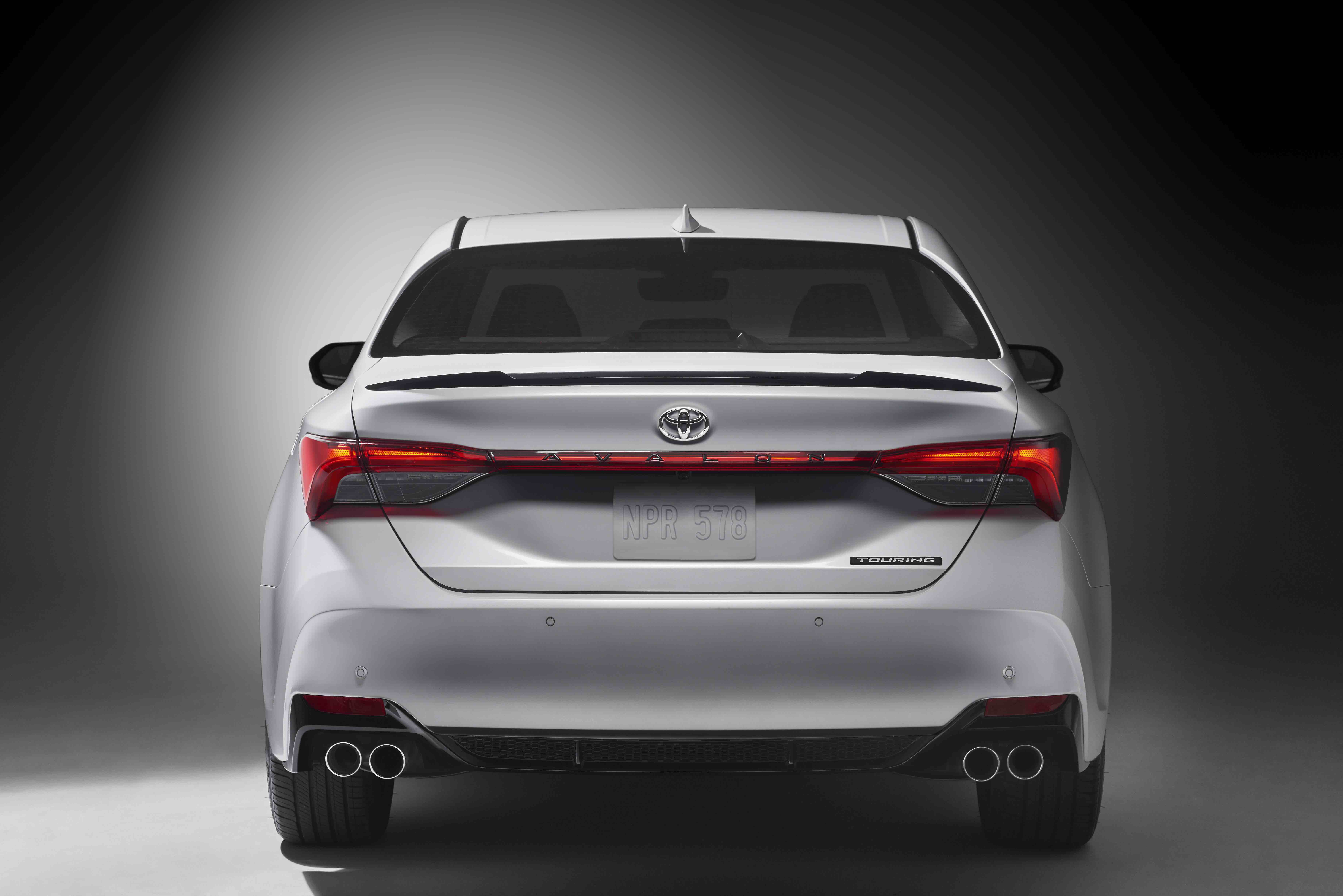
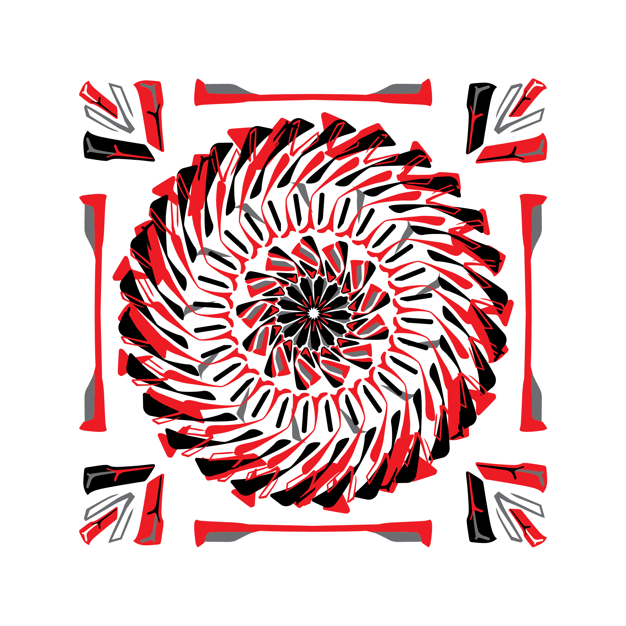
Using the car as the muse, the distinct characteristics such as the rear light, back light, alloy wheel, rear brake light and side grill front bumper were all used to create a unique kaleidoscopic pattern.
To celebrate the Toyota Avalon’s unique features and characteristics by positioning the Avalon as the muse.
Anthony said, “Some of the main objectives of the design project were to create abstract artwork which promoted the dynamism of the Avalon, to use the artwork to create a unique , memorable and limited edition gift for guests at the launch event, to allow for the gift to be gender neutral and versatile, and to draw parallels of the craftsmanship and luxury elements imbued in the Avalon. As the forthcoming launch of the Avalon was the main thing, we wanted to keep the main thing, the main thing”.
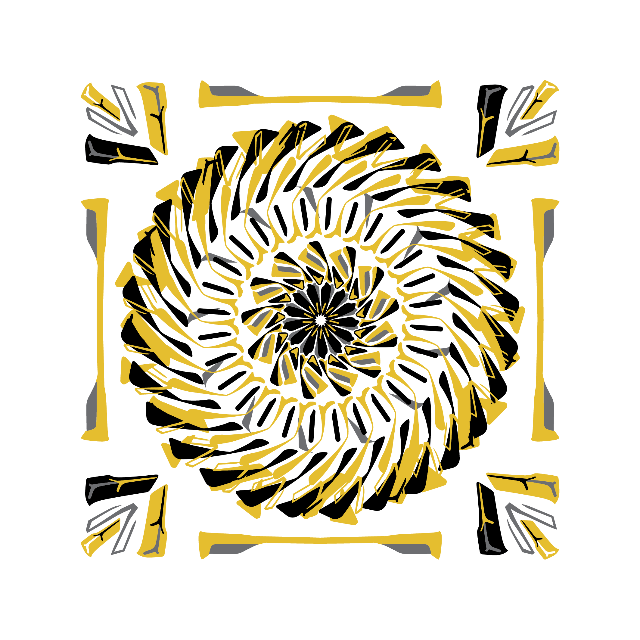
There were 3 different colour-ways, each had a different sentiment.
The colour red in the pattern pays homage to the red in the iconic Toyota logo type, and acknowledges the innovative design of Avalon’s distinctive rear break light.
Utilising the different shapes, we developed a wheel formation with all lines directed towards the centre creating a centrifugal force effect which is a visual representation of the notion of continuous motion.
![]()
 The application of coral blue is a direct reference to the flow and unlimited potential of the sea, ideas come in waves and introducing the blue colour transforms the pattern into a wave.
Over the years Toyota has been at the forefront of new ideas and automotive innovation, pushing boundaries with technological advancements such as Smart Mobile Technology, Intelligent Transport Systems and Quality Durability Reliability.
Waves are also key elements of the current Caton Manifesto collection. This allowed us subtly add some of our own DNA directly to the pattern.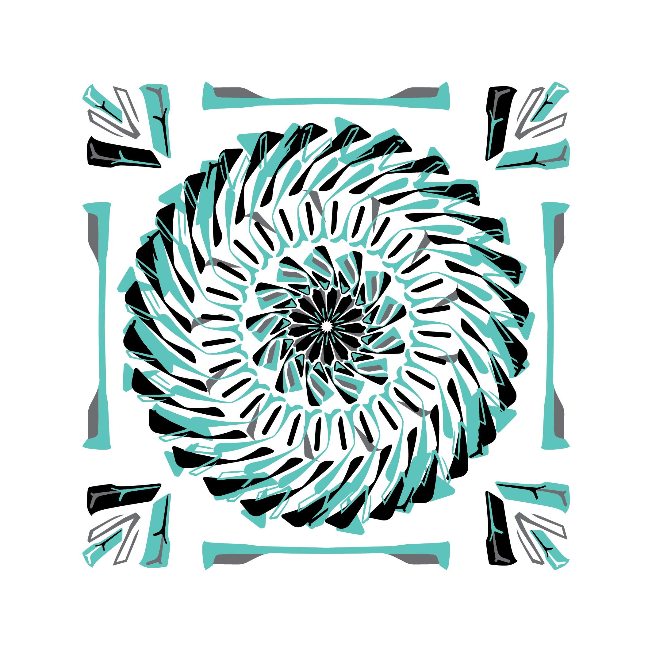
The gold colour way square references the golden tone of the desert sand and Toyota’s humble beginnings in Dubai before the major developments that we see today on Sheikh Zayed road.
Gold is also a symbol of prosperity and value, Toyota has been able to provide value via the number of people who have been employed by directly and who have partnered with the organisation over the decades.
The second phase of the project would take place weeks later.
Images by:
Oliver – www.instagram.com/olvr.Jc
Designers:
Anthony Caton
Benaiah Matheson
Printing Studio :
A big thank you to everyone who facilitated in bringing the vision into manifestation.
Nice dude!
Thanks Adam!